Introduction
Much has been said about the Simpson’s paradox, the famous statistic paradox that leads to reversing association when adding or removing a covariate.
My intention in this post is not to explain the paradox, as many have done it already before me, instead I just provide an illustration to set the context, and then I focus on how to forge data that leads to this paradox.
This post is named after a very inspiring article by Jakob Cohen [1], explaining how the null hypothesis significance testing is misunderstood and misused, although it is the bread and butter of tens of thousands of statisticians around the world.
The post is also inspired by David Louapre’s Science Etonnante(in french) excellent blog.
An example of Simpson’s paradox
Let’s look at a real study performed in the seventies in a UK village [2]. The researchers surveyed women, smoking and non smoking. They then reported the percentage of women still alive 20 years later.
The result was the following:
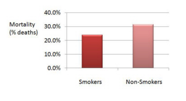
The data shows that the mortality was lower amongst the smokers. How surprising! Something must have gone wrong.
Indeed, if we refine the data and add a covariate, i.e. we now distinguish between classes of age, we see this:
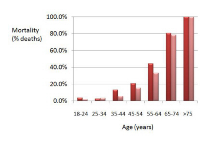
(smokers are in red, non smokers in pink)
What we now observe is that mortality has generally been higher for the smokers than for the non smokers. Sounds more in line we what we expected, doesn’t it?
So what happened? Well, that’s an illustration of the simpson’s paradox. The paradox may happen when an important covariate (factor that has in influence on the result) is missing, and generally under specific circumpstances with unbalanced group sizes (non homogeneity).
There are multiple examples of this paradox appearing in real life situation, including the famous UCI Berkeley students’ admission discrimination case. At first glance, it that appeared the admission ratio for male applicants was higher than that of female applicants (44% versus 35%). However, when splitting data by major, the results no longer showed any discrimination as the admission ratio was approximately similar for both male and females. See this excellent article for more.
The original data
I got interested in forging data whilst studying linear regression. I worked on a small group project and wanted to come up with a striking example, which although it would have coefficients of statistical significance, the regression woud lead to wrong conclusion.
I started with the first study mentionned above (smoking/non smoking). The raw data is presented below
# Initialize environment
import pandas as pd
import seaborn as sns
from __future__ import division
import matplotlib.pyplot as plt
import numpy as np
%matplotlib inline
# Load the data from the original study
data = pd.read_csv("./smoking.data",delim_whitespace=True)
data
| id | age | smoker | alive | dead | |
|---|---|---|---|---|---|
| 0 | 1 | 18-24 | 1 | 53 | 2 |
| 1 | 2 | 18-24 | 0 | 61 | 1 |
| 2 | 3 | 25-34 | 1 | 121 | 3 |
| 3 | 4 | 25-34 | 0 | 152 | 5 |
| 4 | 5 | 35-44 | 1 | 95 | 14 |
| 5 | 6 | 35-44 | 0 | 114 | 7 |
| 6 | 7 | 45-54 | 1 | 103 | 27 |
| 7 | 8 | 45-54 | 0 | 66 | 12 |
| 8 | 9 | 55-64 | 1 | 64 | 51 |
| 9 | 10 | 55-64 | 0 | 81 | 40 |
| 10 | 11 | 65-74 | 1 | 7 | 29 |
| 11 | 12 | 65-74 | 0 | 28 | 101 |
| 12 | 13 | 75+ | 1 | 0 | 13 |
| 13 | 14 | 75+ | 0 | 0 | 64 |
The data could not be visualised as a scatter plot and neither was it possible to fit a regression line. So I decided to forge it.
Forging a simple example
Let’s “study” the hypothetical effect of smoking on libido.
The idea is to create several separate clouds of points. Each cloud, regressed independantly will have a negative coefficients.
But each cloud is located in such a way that is the regression happens on the whole cloud of points, the regression take place in the other direction
# Forge the data
import random

# Male data cloud
# xm: abscissa data, em = randomness for the ordinate, ym = ordianate, sexm = label
xm = [random.randint(18,35) for _ in range(40)]
em = [np.random.normal(0,7)+5 for _ in range(40)]
ym = [10-.5*xm[i]+em[i] for i in range(40)]
sexm = ["Male" for _ in range(40)]

# Female data cloud
# xf: abscissa data, ef = randomness for the ordinate, yf = ordianate, sexf = label
xf = [random.randint(0,22) for _ in range(40)]
ef = [np.random.normal(0,5) for _ in range(40)]
yf = [-5-.75*xf[i]+ef[i] for i in range(40)]
sexf = ["Female" for _ in range(40)]

# Concatenate the male and female data to be able to display aggregated clouds
xt = xm + xf
yt = ym + yf
sext = sexm + sexf
Let’s display the whole data cloud, without differentiating by sex.
import seaborn as sns
x=xt
y=yt
sex=sext
sns.set(style="ticks", context="talk")
data = {"x":xt,"y":yt,"sex":sext}
df = pd.DataFrame(data)
g = sns.lmplot(x="x",y="y",data=df)
g.set_axis_labels("Number of cigarettes per day", "% variation of libido")
plt.show()
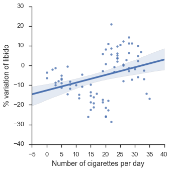
The line seems to indicate a positive correlation between smoking a libido: the more the smoke, the more libido you have.
Now let’s add our age covariate.
f = sns.lmplot(x="x",y="y",hue="sex",data=df)
f.set_axis_labels("Number of cigarettes per day", "% variation of libido")
plt.show()
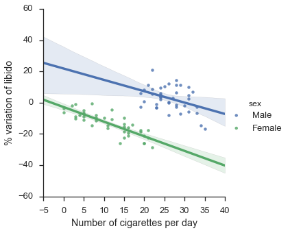
That now looks more as expected… smoking has a negative effect on both groups when taken separately!
Note that in the two graphs, the clouds of points in exactly the same!
Final check… in the first graph, was our coefficient statistically significant?
import statsmodels.api as sm
x_fit = sm.add_constant(x) # Without it intercept is excluded
model = sm.OLS(y, x_fit).fit()
predictions = model.predict(x_fit)
print(model.summary())
                            OLS Regression Results
==============================================================================
Dep. Variable:                      y   R-squared:                       0.111
Model:                            OLS   Adj. R-squared:                  0.099
Method:                 Least Squares   F-statistic:                     9.718
Date:                Sat, 19 Nov 2016   Prob (F-statistic):            0.00255
Time:                        22:41:26   Log-Likelihood:                -300.52
No. Observations:                  80   AIC:                             605.0
Df Residuals:                      78   BIC:                             609.8
Df Model:                           1
Covariance Type:            nonrobust
==============================================================================
                 coef    std err          t      P>|t|      [95.0% Conf. Int.]
------------------------------------------------------------------------------
const        -12.6647      2.636     -4.804      0.000       -17.913    -7.417
x1             0.3917      0.126      3.117      0.003         0.142     0.642
==============================================================================
Omnibus:                        2.345   Durbin-Watson:                   1.591
Prob(Omnibus):                  0.310   Jarque-Bera (JB):                2.253
Skew:                          -0.340   Prob(JB):                        0.324
Kurtosis:                       2.538   Cond. No.                         47.2
==============================================================================

Warnings:
[1] Standard Errors assume that the covariance matrix of the errors is correctly specified.
x1 coefficient has a p value of 0.003, which is significant if we reject the null hypothesis for p<0.05 !
Forging a multi-class example
This second example uses the same technic as previously, but splits into 3 classes.
# Forge the data
import random

# Age group 15-34
x1 = [random.randint(12,40) for _ in range(40)]
e1 = [np.random.normal(0,6) for _ in range(40)]
y1 = [82-.15*x1[i]+e1[i] for i in range(40)]
age1 = ["15-34" for _ in range(40)]

# Age group 35-54
x2 = [random.randint(5,30) for _ in range(40)]
e2 = [np.random.normal(0,5) for _ in range(40)]
y2 = [75-.3*x2[i]+e2[i] for i in range(40)]
age2 = ["35-54" for _ in range(40)]

# Age group 55+
x3 = [random.randint(0,30) for _ in range(40)]
e3 = [np.random.normal(0,4) for _ in range(40)]
y3 = [68-.45*x3[i]+e3[i] for i in range(40)]
age3 = ["55+" for _ in range(40)]

# Concatenate all the groups data to be able to display aggregated clouds
x4 = x1 + x2 + x3
y4 = y1 + y2 + y3
age4 = age1 + age2 + age3
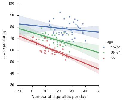
Again, let’s look at the aggregated data (unexepected result), split with covariate (expected result) and the significance factor.
# Display the data without the confounding factor
x=x4
y=y4
age=age4
sns.set(style="ticks", context="talk")
data = {"x":x,"y":y,"age":age}
df = pd.DataFrame(data)
g = sns.lmplot(x="x",y="y",data=df)
g.set_axis_labels("Number of cigarettes per day", "Life expectancy")
plt.show()
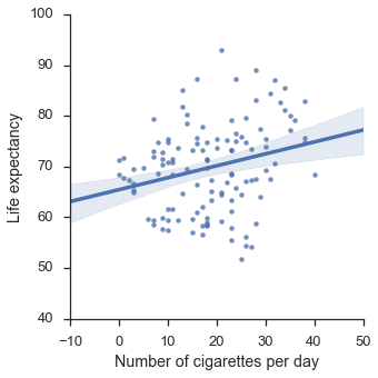
# Show the same data with confounding factor
f = sns.lmplot(x="x",y="y",hue="age",data=df)
f.set_axis_labels("Number of cigarettes per day", "Life expectancy")
plt.show()
# Show the significance of the coefficient
import statsmodels.api as sm
x_fit = sm.add_constant(x) # Without it intercept is excluded
model = sm.OLS(y, x_fit).fit()
predictions = model.predict(x_fit)
print(model.summary())
                            OLS Regression Results
==============================================================================
Dep. Variable:                      y   R-squared:                       0.067
Model:                            OLS   Adj. R-squared:                  0.059
Method:                 Least Squares   F-statistic:                     8.491
Date:                Sat, 19 Nov 2016   Prob (F-statistic):            0.00427
Time:                        22:43:39   Log-Likelihood:                -425.24
No. Observations:                 120   AIC:                             854.5
Df Residuals:                     118   BIC:                             860.0
Df Model:                           1
Covariance Type:            nonrobust
==============================================================================
                 coef    std err          t      P>|t|      [95.0% Conf. Int.]
------------------------------------------------------------------------------
const         65.4403      1.695     38.598      0.000        62.083    68.798
x1             0.2350      0.081      2.914      0.004         0.075     0.395
==============================================================================
Omnibus:                        0.616   Durbin-Watson:                   1.230
Prob(Omnibus):                  0.735   Jarque-Bera (JB):                0.716
Skew:                           0.014   Prob(JB):                        0.699
Kurtosis:                       2.623   Cond. No.                         46.3
==============================================================================

Warnings:
[1] Standard Errors assume that the covariance matrix of the errors is correctly specified.
Generate an example with double paradox
# Forge the data
import random

ar = (8,10)
nr = (10,8)
ap = (15,5)
nP = (17,10)
std = 2

# Male/Smoker
xap = [random.randint(ap[0]-2,ap[0]+2) for _ in range(40)]
e = [np.random.normal(0,1) for _ in range(40)]
yap = [ap[1]+e[i]-1*(xap[i]-np.min(xap)) for i in range(40)]
sap = ["Tobacco" for _ in range(40)]
aap = ["Male" for _ in range(40)]
lap = ["Tobacco + Male" for _ in range(40)]

# Female/Smoker
xnp = [random.randint(nP[0]-2,nP[0]+2) for _ in range(40)]
e = [np.random.normal(0,1) for _ in range(40)]
ynp = [nP[1]+e[i]-1*(xnp[i]-np.min(xnp)) for i in range(40)]
snp = ["Tobacco" for _ in range(40)]
anp = ["Female" for _ in range(40)]
lnp = ["Tobacco + Female" for _ in range(40)]

# Male/E-cigarette
xar = [random.randint(ar[0]-2,ar[0]+2) for _ in range(40)]
e = [np.random.normal(0,1) for _ in range(40)]
yar = [ar[1]+e[i]+.2*(xar[i]-np.min(xar)) for i in range(40)]
sar = ["E cigarettes" for _ in range(40)]
aar = ["Male" for _ in range(40)]
lar = ["E cigarettes + Male" for _ in range(40)]

# Female/E-cigarette
xnr = [random.randint(nr[0]-2,nr[0]+2) for _ in range(40)]
e = [np.random.normal(0,1) for _ in range(40)]
ynr = [nr[1]+e[i]+.2*(xnr[i]-np.min(xnr)) for i in range(40)]
snr = ["E cigarettes" for _ in range(40)]
anr = ["Female" for _ in range(40)]
lnr = ["E cigarettes + Female" for _ in range(40)]

x = xap + xnp + xar + xnr
y = yap + ynp + yar + ynr
s = sap + snp + sar + snr
a = aap + anp + aar + anr
l = lap + lnp + lar + lnr
Let’s look at our overall data. Does smoking tobacco or e-cigarettes impact your health?
# Display without confounding factor
data = {"x":x,"y":y,"smoke":s,"athlet":a,"label":l}
df = pd.DataFrame(data)

f = sns.lmplot(x="x",y="y",data=df)
f.set_axis_labels("Number of cigarettes per day", "% very healthy people")
plt.show()
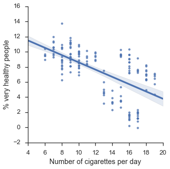
Ok, so far so good, it looks like smoking damages your health as expected.
Let’s add a covariate and split by what people smoke.
# Display woth one confounding factor
f = sns.lmplot(x="x",y="y",hue="smoke",data=df)
f.set_axis_labels("Number of cigarettes per day", "% very healthy people")
plt.show()
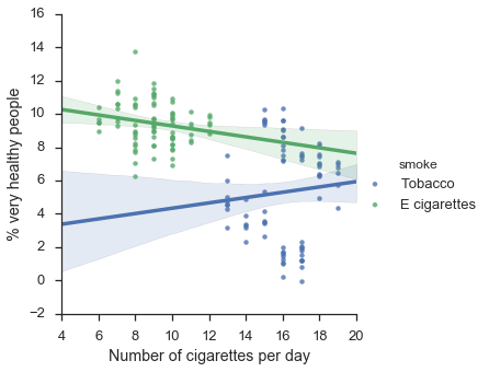
Uh-oh! Now it appears tobacco is having a positive effect on health, whereas e-cigarettes are slightly harmful. Strange isn’t it?
Let’s add again one more covariate!
# Display with two confounding factors
f = sns.lmplot(x="x",y="y",hue="label",data=df)
f.set_axis_labels("Number of cigarettes per day", "% very healthy people")
plt.show()
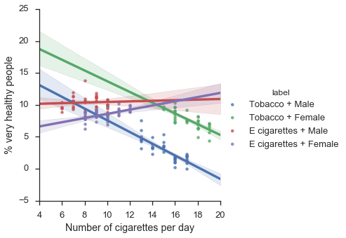
Now we see a double reversal of the simpson’s paradox! By adding successively new covariates, we were able to obtain successively very different results!
Conclusion
As we just saw, you can get a lot out of data, pretty much you can get them to tell anything you want!
So as a data scientist, you need to be aware of the Simpson’s paradox so you can spot it when it occurs, that’s a no brainer.
But most of all, it shows the importance of being a subject matter expert, or working with one, of area/data you want to process.
References
[1] Cohen. “The earth is round, p<0.05” The American Psychologist 49.12 (1994): 997-1003
[2] Appleton, David R., Joyce M. French, and Mark PJ Vanderpump. “Ignoring a covariate: An example of Simpson’s paradox.” The American Statistician 50.4 (1996): 340-341.